Sunday, August 12, 2012

Creating a simple control with dimension

This was the original reason a co-worker suggested I blog some of my work. It is a relatively simple design trick but he really liked it and liked the fact it was easy and didn't require a lot of reworking to get the effect.

Step 1: I created a UserControl that contained a simple shape (in this case a circle) - for this example it will use chrome style brushes. I haven't worked with solid or gradient brushes - that will be later after I figure out the Silverlight charts a bit more. (The charts are for a current assignment, but I do want to catch up on documenting what I have been able to accomplish)
The user control also has a drop shadow applied to the shape - this helps with the final artwork having the look of dimension.
The image above shows the final basic user control.

Step 2. Created a new document (UserControl) where I imported the basic control, and copied and pasted several times. Each subsequent layer reduced using the the transform tool in Blend. (This example uses the preview of Blend 5 available from Microsoft. )
This moved the position of the chrome brushes up slightly, giving the appearance they were still using the same reflection but one was above the other.
Above is a closeup of the positioning of each control layer - they all have the exact same center, but by reducing the size the chrome effect of the brushes moves up slightly. Also, the border has a different chrome style brush than the fill does. The difference is very slight but it helps with the dimensional effect.

Step 3. Layer the control to achieve the desired affect. Below shows the complete dimensional control. When using a "curved" chrome brush - it really helps the effect pop. But, that will be a separate post since I am still catching up on figuring out a bit more coding.


Not the perfect representation, but it is all XAML, and you only have to make the image once to reuse on several other controls or pages. Could also be a good button background.

I have uploaded the files here for you to play with. It includes the brushes as well.


Wednesday, May 23, 2012

Changing the color of Area Chart Fill without C#

After looking over several websites, googling like crazy, and finding all sorts of complicated code I took notes of and still just didn't understand, I finally figured out how to "easily" change the color of the area chart fill.

Below is the basic, every day area chart - default blue color:


Below is the code I wrote to create the chart (the points are set in the code behind, I didn't want to mess up this code with the points set inline):

<UserControl
    xmlns="http://schemas.microsoft.com/winfx/2006/xaml/presentation"
    xmlns:x="http://schemas.microsoft.com/winfx/2006/xaml"
    xmlns:d="http://schemas.microsoft.com/expression/blend/2008"
    xmlns:mc="http://schemas.openxmlformats.org/markup-compatibility/2006"
    xmlns:controls="clr-namespace:System.Windows.Controls;assembly=System.Windows.Controls"
    xmlns:controlsToolkit="clr-namespace:System.Windows.Controls;assembly=System.Windows.Controls.Toolkit"
    xmlns:chartingToolkit="clr-namespace:System.Windows.Controls.DataVisualization.Charting;assembly=System.Windows.Controls.DataVisualization.Toolkit"
    xmlns:chartingPrimitivesToolkit="clr-namespace:System.Windows.Controls.DataVisualization.Charting.Primitives;assembly=System.Windows.Controls.DataVisualization.Toolkit"
    xmlns:chartingPrimitives="clr-namespace:System.Windows.Controls.DataVisualization.Charting.Primitives;assembly=System.Windows.Controls.DataVisualization.Toolkit"
    xmlns:telerik="http://schemas.telerik.com/2008/xaml/presentation"
    xmlns:toolkit="http://schemas.microsoft.com/winfx/2006/xaml/presentation/toolkit"
    mc:Ignorable="d"
    x:Class="XAMLTestingScreens.AreaChartExample"
    Width="640" Height="480">

    <Grid x:Name="LayoutRoot" Background="White">
        <Canvas>
            <toolkit:Chart Title="Area Series Fill" x:Name="AreaSeriesFill" BorderBrush="Transparent" Width="640" Height="480">
                <toolkit:Chart.Axes>
                    <toolkit:LinearAxis x:Name="AxisOne" Foreground="Black"
                                        Title="Width" ShowGridLines="True"
                                        Orientation="X" Minimum="0" Maximum="40" Interval="5"/>
                    <toolkit:LinearAxis x:Name="AxisTwo" Foreground="Black" Title="Height"
                                        ShowGridLines="True" Orientation="Y" Minimum="0" Maximum="40" Interval="5"/>
                </toolkit:Chart.Axes>
               
                <toolkit:AreaSeries Title="Change Color" x:Name="changecolor" ItemsSource="{Binding}"
                                    IndependentValueBinding="{Binding Width}" DependentValueBinding="{Binding Height}"/>
            </toolkit:Chart>
        </Canvas>
    </Grid>
</UserControl>

I want to have the area below the plotted line (the fill) in red, and of course the corresponding Legend Item in the same color.

Here is the updated chart with the new color.


Below is the section of updated code:

<toolkit:AreaSeries Title="Change Color" x:Name="changecolor"
                                    ItemsSource="{Binding}"
                                    IndependentValueBinding="{Binding Width}"
                                    DependentValueBinding="{Binding Height}">
                    <toolkit:AreaSeries.DataPointStyle>
                        <Style TargetType="toolkit:DataPoint">
                            <Setter Property="Background" Value="Red" />
                        </Style>
                    </toolkit:AreaSeries.DataPointStyle>
                </toolkit:AreaSeries>

The highlighted area is the updated code.
All I did was add the DataPointStyle and set the background color. However, the area is not solid, and looks pink (not what I wanted) so I have to update the Opacity as well.


Below is the code for the brighter chart:

<toolkit:AreaSeries Title="Change Color" x:Name="changecolor"
                                    ItemsSource="{Binding}"
                                    IndependentValueBinding="{Binding Width}"
                                    DependentValueBinding="{Binding Height}" IsHitTestVisible="False">
                    <toolkit:AreaSeries.DataPointStyle>
                        <Style TargetType="toolkit:DataPoint">
                            <Setter Property="Background" Value="Red" />
                            <Setter Property="Opacity" Value="1.0" />
                        </Style>
                    </toolkit:AreaSeries.DataPointStyle>
                    <toolkit:AreaSeries.Style>
                        <Style TargetType="toolkit:AreaSeries">
                            <Setter Property="PathStyle">
                                <Setter.Value>
                                    <Style TargetType="Path">
                                        <Setter Property="Opacity" Value="1.0" />
                                    </Style>
                                </Setter.Value>
                            </Setter>
                        </Style>
                    </toolkit:AreaSeries.Style>
                </toolkit:AreaSeries>

The opacity is set using the AreaSeries.Style - pointing to a PathStyle. 

I was SO HAPPY to find a much easier way to change the colors, I really was not looking forward to coding upteen too many lines.

Hope this is helpful to someone else too.


PS: Below is the VERY basic code behind that I used to create the points for this graph:

using System.Windows.Documents;
using System.Windows.Input;
using System.Windows.Ink;
using System.Globalization;
using System.Threading;
using System.Windows.Media;
using System.Windows.Media.Imaging;
using System.Windows.Controls.DataVisualization.Charting;
using System.Windows.Controls.DataVisualization;
using System.ComponentModel;
using System.Windows.Shapes;

namespace XAMLTestingScreens
{
    public partial class AreaChartExample : UserControl
    {
        public AreaChartExample()
        {
            // Required to initialize variables
            InitializeComponent();
           
            this.LayoutRoot.DataContext = this;
           
            this.Loaded += new RoutedEventHandler(UC_Loaded);
           
           
        }
       
        void UC_Loaded (object sender, RoutedEventArgs e)
        {
       
            List<ColorChangePoints> colorchange = new List<ColorChangePoints>();
            colorchange.Add(new ColorChangePoints() {Width=0,Height=0});
            colorchange.Add(new ColorChangePoints() {Width=5,Height=10});
            colorchange.Add(new ColorChangePoints() {Width=10,Height=20});
            colorchange.Add(new ColorChangePoints() {Width=15,Height=15});
            colorchange.Add(new ColorChangePoints() {Width=20,Height=30});
            colorchange.Add(new ColorChangePoints() {Width=25,Height=15});
            colorchange.Add(new ColorChangePoints() {Width=30,Height=35});
            colorchange.Add(new ColorChangePoints() {Width=35,Height=10});
            colorchange.Add(new ColorChangePoints() {Width=40,Height=20});
           
            AreaSeries changecolor = AreaSeriesFill.Series[0] as AreaSeries;
           
            changecolor.IndependentValuePath = "Width";
            changecolor.DependentValuePath = "Height";
            changecolor.ItemsSource = colorchange;
        }
       
        public class ColorChangePoints
        {
            public double Width {get; set;}
            public double Height {get; set;}
        }
    }
}
Nothing special, but it's easier for me than hard coding it into the XAML

I've uploaded a copy of the project for you to play around with.

Thursday, May 10, 2012

Reversing a Silverlight Line Chart with XAML only

UPDATE:
I figured out the reversal, however the chart needed to plot downward and not left to right.

After trying to plot using the example below, the lines did not plot right. They were jagged and the graph did not plot any of the points in order.

One of my coworkers made the observation that the Silverlight charts always run left to right - for some reason it even happened when I "flipped" the chart in the way I previously tried (described below). However - the actual PLOTTING had remained the same. 

So, by going into the control template, I was able to translate the actual plotting area for the line to actually flow downward.

Went ahead and posted the explanation here.

*******************************


Wanted to reverse a Line Chart in Silverlight. All I could find were solutions using C#, and I am not the C-sharpest (I am more C-dull) so I decided to play around with the styles and options in the Linear Chart that is in the Silverlight 5 toolkit. (Have not tested it in Silverlight 4).

I looked at the code for the chart and couldn't figure out why it all had to be in C#, the elements themselves could use RenderTransform to change their orientation.

Started with the basic control, Layout Root. Added a Canvas for my new chart. I do include the entire list of xmlns definitions at the top. It helps me remember what to use, and kept getting frustrated with seeing a solution, but not what I needed to refer to so that it would WORK for me. I am still at the basic level when it comes to coding.


Make sure that you have the System.Windows.Controls.DataVisualization.Toolkit.dll in your References folder, or this won't work.


You can download the most current Silverlight Toolkit here.

Ok, from this point on - I am only showing the main code used in the actual line graph. That top part is LONG. Started with the basic line chart, and I did separate out the Axis Titles, this way if they need to be rotated I just rotate the TextBlock without affecting the entire axis.


Then added the LineSeries (these are notes for me, and I know I would forget this part too - so, have to make sure that I keep track of this chart item as well)


I didn't want to create the points for this entry in the code behind, so I used the answer to this post and just defined the points in the XAML for now. 

I also went ahead and finished defining the minimum and maximum for both of the axes - for the X-Axis, I gave an Interval of 2 so more lines would show.

Below is the finished code and a screenshot of the chart itself - right now it is the basic, default chart without any styling.


Since the code has become rather long (for me to keep copying and making it readable) I will just show the individual elements of the chart as I change them.

First, I reversed the actual Axis Labels on the Y axis - this has not changed the line as the preview shows. I added the RenderTransform Code to the elements - this is why I separated the Title of the Axis using <chartingToolkit:LinearAxis.Title> and a TextBlock. Since it automatically rotates with the axis, I can rotate it back to where it should be.

For the Labels, they will be upside down once you reverse the ScaleY of the axis, but by using the <chartingToolkit:LinearAxis.AxisLabelStyle> I can transform them back to the orientation they need to be.


Now, I just need to reverse the line on this chart - and it will display like I want it too - the zero at the top left hand corner and going DOWN as values change.

Reversing the LineSeries is SUPER easy - all I did was add
 <toolkit:LineSeries.RenderTransform>
<CompositeTransform ScaleY="-1" />
</toolkit:LineSeries.RenderTransform>

Now the line is reversed with the Y axis - and I have the chart the way I wanted it - the Y axis reversed with 0 on the top.


And there it is - a reversed chart where I didn't fry my brain on C# (it did fry a bit on the XAML since I had to play around with it and came up with a lot of deformed charts).

I've uploaded the file for you to play with/use.


Tuesday, May 8, 2012

Reusable Brushes (Resource Dictionaries)

One of the nice things in Silverlight/WPF is the way Resource Dictionaries can help create a standard set of application brushes - used in the design keeps all of the colors consistent and preserve the design when sent over to production and deployment.

Below is a screenshot of the starting Blend Screen - this is what you see when you create a new project. Most will be different depending on how you set up your screen, but this is just going over some of the basics, helps to explain the process (for me at least).

The "Projects" window in the upper left shows you what files are currently in your project, "Assets" and "Stages" are not used when creating a Resource Dictionary. The "Objects and Timeline" window below "Projects" displays the elements you have either created or imported into the file. Think of this file as a new Illustrator file, the LayoutRoot grid is the new page and the "Objects and Timeline" window shows you the objects based on what layer they are in the file.


Step 1. Create a new folder in the project files.
I create a new folder so I can easily find my resource dictionaries - and keep them all in one place. Sort of like collecting images for print projects in InDesign. Everything for the document is now in one place and can be referenced through the entire document (or project for Silverlight).


I right click on the project name (for this demo it is XAMLTestingScreens) which brings up a menu - Choose "Add New Folder". I name my folder "Resources" since it is easy for me to remember.

Right click on your new folder, the same options menu will be displayed, this time select "Add New Item." This will bring up a dialog window showing various file types you can add to your current project.

Select "Resource Dictionary" - I named mine "Brushes.xaml" so it is easy for me to reference later as I build more functionality and design into this project.

You will now see a new file named (ok, I will in this demo) "Brushes.xaml" - there is no C# codebehind, since there is no real functionality to this document. Think of it as a .css file you use to style the Silverlight controls and elements.


I used the same brush I made for the chrome brush notes, just so I don't have to remake anything for this - the XAML for our Resource Dictionary now looks like below.


 In order to reference this dictionary you have to make sure the file App.xaml includes the newly created Resource Dictionary (in this case Brushes.xaml) in it's listing of used style files.

For this small project the App.xaml file is located in the very top/first project named "XAMLTesting", it is usually located in your topmost project that is the name of the Silverlight file (nothing after the name such as XAMLTestingScreens).

Below is what we currently have in our App.xaml file for this mini project:
<Application
    xmlns="http://schemas.microsoft.com/winfx/2006/xaml/presentation"
    xmlns:x="http://schemas.microsoft.com/winfx/2006/xaml"
    x:Class="XAMLTesting.App">
    <Application.Resources>
          <ResourceDictionary>
            <ResourceDictionary.MergedDictionaries>
                <ResourceDictionary Source="/Microsoft.Expression.Prototyping.SketchControls;component/ScrollViewerStyles.xaml"/>
                <ResourceDictionary Source="/XAMLTesting.Screens;component/SketchStyles.xaml"/>
                <ResourceDictionary Source="/XAMLTesting.Screens;component/Resources/Brushes.xaml"/>
            </ResourceDictionary.MergedDictionaries>
        </ResourceDictionary>
    </Application.Resources>
</Application>

It lists all of the resource dictionaries that the application is supposed to use - the SketchStyles and ScrollViewerStyles are default when you create a Silverlight Sketchflow project (which this is).

This line should automatically be placed in your App.xaml file - and you will see a tab at the top of your page saying "App.xaml*" - the star means the file has not been saved yet - save your file and then rebuild the project. After you rebuild - you will be able to see the new file in the"Resources" Tab/Window on the right hand side.


Go back to the properties panel - click on the white box next to the "Fill" color selector. You will get a dropdown box - choose "Local Resources" for a selection of brush styles available to you in the application. Choose the "MyChrome" brush (this name is the x:Key value in the resource dictionary file.)
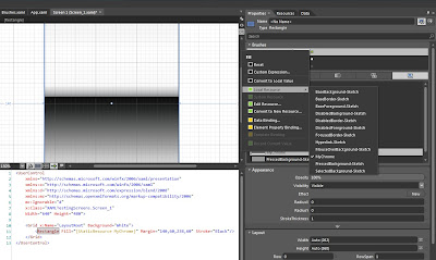


After you have selected this option, your shape will now have the newly chosen brush from your resource dictionary. You can now use this brush on any of your application controls or pages without having to recreate it - saving both coding time and number of lines in the file.
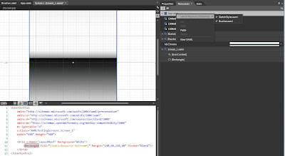


 Above, you can see the XAML created by Blend to link the rectangle to this brush - it is now a "StaticResource" letting the application know it is a predefined resource and what key to use when referencing this brush style/definition.

You now have a rectangle (or any shape) with this brush as the fill.


Thursday, April 26, 2012

Chrome LinearGradientBrush

Wanted to create a way to show a chrome effect, without having several borders or paths layered on top of each other. My coworker (hey there Matt  ( ^_^ )/" ) suggested using brushes only to keep the number of UserControls down to a minimum.

It made sense, and I had to go back to my Adobe Illustrator days (since I am working in Blend right now creating XAML with the Properties panel) and remember that linear gradient fills can be created to look like chrome, using several gradients stops (for XAML it is called a GradientStop for each color and where it falls within the actual brush).

By working with the brushes, and using the gradient tool arrow - I was able to come up with a nice chrome style brush. I'll have to practice to get the chrome to look a bit differently, but this is perfect for what I need it for now.

First: I created a new UserControl to create the brush so I wouldn't accidentally change any of the elements in one of my current controls (which I have done several times before). I just called it LinearBrushCreator, nothing fancy but I know what it is for.

I filled the rectangle with a very basic black and white LinearGradientBrush, which is the default in Blend when you choose to fill the element with a gradient. The image below shows where the brush fill options are in the Properties panel. Select the item, and it will show the different properties that can have a brush applied to it. Since this is a rectangle it has a Fill property (element), if it were a border it would have the Background property for the fill of the shape.


Afterwards, I went to the toolbar and chose the Gradient Tool. When the rectangle is selected and you have the Gradient Tool (The white arrow that is second from the top, or right below the solid black arrow) chosen, there is an arrow that is displayed on the rectangle. This arrow shows the direction of the gradient, and there are points (the little circles) and these represent what color is at that specific GradientStop in the LinearGradientBrush.


Below is the Rectangle with the arrow showing the brushes direction and colors.


The easiest way I found to add and manipulate the colors on the brush is to use the arrow and not the slider on the Properties panel. You can zoom in and out on the arrow's point, instead of trying to move tiny boxes that represent the colors. 

The easiest way to add a GradientStop is to have the Selection Tool (Solid Arrow at the very top of the toolbar) chosen, then click on the arrow. This creates a new point (circle) that you can change the color on by using the Color Selection box in the Properties panel.

After several changes, and adding several points to the arrow, I was able to create a brush fill I was happy with and is consistent with the application's overall theme.

This image shows how many different points I used to create this fill effect.


Below is the finished XAML for this Chrome Brush design.

<LinearGradientBrush x:Key="MyChrome" EndPoint="0.5,1" StartPoint="0.5,0">
        <GradientStop Color="#FF181818" Offset="0.495"/>
        <GradientStop Color="#FFCACACA" Offset="0.46"/>
        <GradientStop Color="#FFF3F3F3" Offset="0.997"/>
        <GradientStop Color="#FFC8C8C8" Offset="0.788"/>
        <GradientStop Color="White" Offset="0.006"/>
        <GradientStop Color="White" Offset="0.966"/>
        <GradientStop Color="#FF242525" Offset="0.531"/>
        <GradientStop Color="#FF1D1D1D"/>
        <GradientStop Color="White" Offset="0.215"/>
        <GradientStop Color="#FF060606" Offset="0.463"/>
        <GradientStop Color="#FFF1F1F1" Offset="0.006"/>
        <GradientStop Color="#FFFBFBFB" Offset="0.401"/>
        <GradientStop Color="#FF96999B" Offset="0.458"/>
        <GradientStop Color="#FFCCCCCC" Offset="0.434"/>
        <GradientStop Color="#FFD0D0D0" Offset="0.002"/>
    </LinearGradientBrush>


Now, going to try this again (MUCH later though) for a few different patterns that would work better on different controls.

Wednesday, April 25, 2012

Simplified Digital Clock for Silverlight

Another personal note to help me remember how to create a very simple digital clock in Silverlight. Posted if other people are working on a simple clock and don't want to write a lot of code.

Got most of the code from this CodeProject Post.

This is creating a very simple clock display using TextBlocks.

There are four TextBlocks - each are named
1. ClockDay
2. ClockMonth
3.ClockYear
4. ClockTime

In order for the required commands to work, you need the following statements at the very top of the C# codebehind:

using System.Windows.Input;
using System.Threading;
using System.Windows.Media;
using System.Windows.Threading;
using System.Windows.Media.Animation;
using System.Windows.Shapes;

Once those are called, then just setting up the actual codebehind

namespace MyClockApp
{
   public partial class MyDigitalClockDisplay : UserControl
   {
      public MyDigitalClockDisplay()
      {
         InitializeComponent();

         this.LayoutRoot.DataContext = this; // I had other items with bindings on this control

        StartTimer()
      }
   
   private void StartTimer()
   {
      DispatcherTimer myDispatcherTimer = new DispatcherTimer()
      myDispatcherTimer.Interval = new TimerSpan(0,0,1);
      myDispatcherTimer.Tick += new EventHandler(Each_Tick);
      myDispatcherTimer.Start();
    }

   private void Each_Tick(object sender, EventArgs e)
   {

     // A listing of the different string formats for the DateTime are defined on this Microsoft Page.
      ClockDay.Text = DateTime.Now.ToString("dd");
      ClockMonth.Text = DateTime.Now.ToString("MMMM");
     ClockYear.Text = DateTime.Now.ToString("yyyy");
      ClockTime.Text = DateTime.Now.ToString("hh:mm:ss");
}
}
}


Below is an image showing the layout I used and which TextBlock was used for each of the values.


Tuesday, April 24, 2012

"Dynamic" LinearGradientBrush using a public class

(Still working on this - more info later. Below is the code to create the effect)

1. Create a new class object in Blend (or Visual Studio). (Such as ElementItems.cs)
2. In the class, create a public class (such as public class LinearBrushItems... full example below)

namespace ThisApplication
{
   public class ElementItems
    {
       public ElementItems()
        {
         }

       public class LinearBrushItems
      {
           // the line below extracts the EndPoint for the brush. This is why it is defined as a Point
            public Point EndPoint {get; set;}
           // the line below extracts the StartPoint for the brush. This is why it is defined as a Point
           public Point StartPoint {get; set;}
           // sets the GradientStopCollection for the brush
           // the GradientStopCollection defines the GradientStops for the brush, and the colors
           public GradientStopCollection GradientStopCollection {get; set;}
      }
}


The GradientStopCollection is defined in a Resource Dictionary. It is implied in a LinearGradientBrush definition - if the entire framework of the LinearGradientBrush was displayed it would be:

<LinearGradientBrush EndPoint="0,0" StartPoint="1,1">
   <GradientStopCollection >
        <GradientStop Color="Blue" Offset="0.296"/>
        <GradientStop Color="Yellow" Offset="0.985"/>
        <GradientStop Color="Green" Offset="0.041"/>
        <GradientStop Color="Red" Offset="0.696"/>
        <GradientStop Color="White" Offset="0.307"/>
        <GradientStop Color="Black" Offset="0.744"/>
    </GradientStopCollection>
</LinearGradientBrush>

Giving the GradientStopCollection a key, and defining in a Resource Dictionary, can be reused without creating a new brush. 

<GradientStopCollection x:Key="RainbowGradientOne">
        <GradientStop Color="Blue" Offset="0.296"/>
        <GradientStop Color="Yellow" Offset="0.985"/>
        <GradientStop Color="Green" Offset="0.041"/>
        <GradientStop Color="Red" Offset="0.696"/>
        <GradientStop Color="White" Offset="0.307"/>
        <GradientStop Color="Black" Offset="0.744"/>
    </GradientStopCollection>


:NOTE:
If there are any LinearGradientBrushes that are an exact duplicate of the GradientStops defined in the GradientStopCollection you will see the error "Value does not fall within the expected range". For example: if the LinearGradientBrush and the GradientStopCollection in this example were defined in the same application (even if in different Resource Dictionaries) - the application will throw this error.

When I got that error, I looked all over and read several possible fixes. When Blend gave me that error - after hitting ok when it asked to see the results panel, that is the error it gave.
It did give another error before I hit the ok on the dialog window. By increasing the results window before building, I was able to see the initial error - which gave the explanation that there was a duplicate definition.

To use the class in a UserControl (haven't tried in a page yet)

<UserControl
   xmlns="http://schemas.microsoft.com/winfx/2006/xaml/presentation"
    xmlns:x="http://schemas.microsoft.com/winfx/2006/xaml"
    xmlns:d="http://schemas.microsoft.com/expression/blend/2008"
   xmlns:local = "clr-namespace:This Application"
 x:Class="ThisApplication.GradientTest"/>

<UserControl.Resources>
<!-- The local definition for the LinearGradientBrush Elements HAS to have a key associated with it -->
<local:LinearBrushItems x:Key="BasicRainbowGradient"
                                          EndPoint="0,0"
                                          StartPoint="1,1"
                                          GradientStopCollection="{StaticResource RainbowGradientOne}" />
</UserControl.Resources>

<Border x:Name="ThisBorder">
   <Border.Background>
<LinearGradientBrush
               EndPoint="{Binding Source={StaticResource BasicRainbowGradient}, Path=EndPoint}"
               StartPoint="{Binding Source={StaticResource BasicRainbowGradient}, Path=StartPoint}"
              GradientStops="{Binding Source={StaticResource BasicRainbowGradient}, Path=GradientStopCollection}" />
            </Border.Background>
</Border>
</UserControl>

This will give the LinearGradientBrush the elements defined in the "BasicRainbowGradient" defined in the UserControl.Resources.