By adding the xmlns namespace xmlns:extra="http://schemas.microsoft.com/netfx/2007/xaml/presentation" I was able to use the FormatConvertedBitmap class.
One way to use it is to define the Bitmap image as a StaticResource:
xmlns:extra="http://schemas.microsoft.com/netfx/2007/xaml/presentation"
<Grid x:Name="LayoutRoot" Width="304" Height="360">
<Grid.Resources>
<BitmapImage x:Key="MyPhoto" UriSource="Images/myPhoto.png"/> <extra:FormatConvertedBitmap x:Key="convertedImage" Source="{StaticResource MyPhoto}" DestinationFormat="Gray32Float" />
</Grid.Resources>
<Border x:Name="ImageBorder" ClipToBounds="True">
<Image HorizontalAlignment="Stretch" VerticalAlignment="Stretch" Source="{StaticResource convertedImage}" Margin="-25" ClipToBounds="True" />
</Border>
</Grid>
Another way I was able to use it - was to put the Binding (from the control's view model) into the actual definition - and still keep the source of the Image as the StaticResource.
<extra:FormatConvertedBitmap x:Key="convertedImage" Source="{Binding ImageSource}" DestinationFormat="Gray32Float" />
More information here.
Showing posts with label WPF. Show all posts
Showing posts with label WPF. Show all posts
Tuesday, September 29, 2015

Sunday, August 12, 2012
Creating a simple control with dimension
This was the original reason a co-worker suggested I blog some of my work. It is a relatively simple design trick but he really liked it and liked the fact it was easy and didn't require a lot of reworking to get the effect.
Step 1: I created a UserControl that contained a simple shape (in this case a circle) - for this example it will use chrome style brushes. I haven't worked with solid or gradient brushes - that will be later after I figure out the Silverlight charts a bit more. (The charts are for a current assignment, but I do want to catch up on documenting what I have been able to accomplish)
The user control also has a drop shadow applied to the shape - this helps with the final artwork having the look of dimension.
 The image above shows the final basic user control.
Step 2. Created a new document (UserControl) where I imported the basic control, and copied and pasted several times. Each subsequent layer reduced using the the transform tool in Blend. (This example uses the preview of Blend 5 available from Microsoft. )
This moved the position of the chrome brushes up slightly, giving the appearance they were still using the same reflection but one was above the other.
 Above is a closeup of the positioning of each control layer - they all have the exact same center, but by reducing the size the chrome effect of the brushes moves up slightly. Also, the border has a different chrome style brush than the fill does. The difference is very slight but it helps with the dimensional effect.
Step 3. Layer the control to achieve the desired affect. Below shows the complete dimensional control. When using a "curved" chrome brush - it really helps the effect pop. But, that will be a separate post since I am still catching up on figuring out a bit more coding.

Step 1: I created a UserControl that contained a simple shape (in this case a circle) - for this example it will use chrome style brushes. I haven't worked with solid or gradient brushes - that will be later after I figure out the Silverlight charts a bit more. (The charts are for a current assignment, but I do want to catch up on documenting what I have been able to accomplish)
The user control also has a drop shadow applied to the shape - this helps with the final artwork having the look of dimension.

Step 2. Created a new document (UserControl) where I imported the basic control, and copied and pasted several times. Each subsequent layer reduced using the the transform tool in Blend. (This example uses the preview of Blend 5 available from Microsoft. )
This moved the position of the chrome brushes up slightly, giving the appearance they were still using the same reflection but one was above the other.

Step 3. Layer the control to achieve the desired affect. Below shows the complete dimensional control. When using a "curved" chrome brush - it really helps the effect pop. But, that will be a separate post since I am still catching up on figuring out a bit more coding.

Not the perfect representation, but it is all XAML, and you only have to make the image once to reuse on several other controls or pages. Could also be a good button background.
I have uploaded the files here for you to play with. It includes the brushes as well.
Tuesday, May 8, 2012
Reusable Brushes (Resource Dictionaries)
One of the nice things in Silverlight/WPF is the way Resource Dictionaries can help create a standard set of application brushes - used in the design keeps all of the colors consistent and preserve the design when sent over to production and deployment.
Below is a screenshot of the starting Blend Screen - this is what you see when you create a new project. Most will be different depending on how you set up your screen, but this is just going over some of the basics, helps to explain the process (for me at least).
The "Projects" window in the upper left shows you what files are currently in your project, "Assets" and "Stages" are not used when creating a Resource Dictionary. The "Objects and Timeline" window below "Projects" displays the elements you have either created or imported into the file. Think of this file as a new Illustrator file, the LayoutRoot grid is the new page and the "Objects and Timeline" window shows you the objects based on what layer they are in the file.

Step 1. Create a new folder in the project files.
I create a new folder so I can easily find my resource dictionaries - and keep them all in one place. Sort of like collecting images for print projects in InDesign. Everything for the document is now in one place and can be referenced through the entire document (or project for Silverlight).

I right click on the project name (for this demo it is XAMLTestingScreens) which brings up a menu - Choose "Add New Folder". I name my folder "Resources" since it is easy for me to remember.
Right click on your new folder, the same options menu will be displayed, this time select "Add New Item." This will bring up a dialog window showing various file types you can add to your current project.

Select "Resource Dictionary" - I named mine "Brushes.xaml" so it is easy for me to reference later as I build more functionality and design into this project.
You will now see a new file named (ok, I will in this demo) "Brushes.xaml" - there is no C# codebehind, since there is no real functionality to this document. Think of it as a .css file you use to style the Silverlight controls and elements.

I used the same brush I made for the chrome brush notes, just so I don't have to remake anything for this - the XAML for our Resource Dictionary now looks like below.

In order to reference this dictionary you have to make sure the file App.xaml includes the newly created Resource Dictionary (in this case Brushes.xaml) in it's listing of used style files.
For this small project the App.xaml file is located in the very top/first project named "XAMLTesting", it is usually located in your topmost project that is the name of the Silverlight file (nothing after the name such as XAMLTestingScreens).
Below is what we currently have in our App.xaml file for this mini project:
It lists all of the resource dictionaries that the application is supposed to use - the SketchStyles and ScrollViewerStyles are default when you create a Silverlight Sketchflow project (which this is).
This line should automatically be placed in your App.xaml file - and you will see a tab at the top of your page saying "App.xaml*" - the star means the file has not been saved yet - save your file and then rebuild the project. After you rebuild - you will be able to see the new file in the"Resources" Tab/Window on the right hand side.

Go back to the properties panel - click on the white box next to the "Fill" color selector. You will get a dropdown box - choose "Local Resources" for a selection of brush styles available to you in the application. Choose the "MyChrome" brush (this name is the x:Key value in the resource dictionary file.)
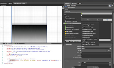
After you have selected this option, your shape will now have the newly chosen brush from your resource dictionary. You can now use this brush on any of your application controls or pages without having to recreate it - saving both coding time and number of lines in the file.
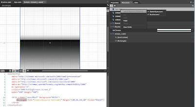
Above, you can see the XAML created by Blend to link the rectangle to this brush - it is now a "StaticResource" letting the application know it is a predefined resource and what key to use when referencing this brush style/definition.
You now have a rectangle (or any shape) with this brush as the fill.

Below is a screenshot of the starting Blend Screen - this is what you see when you create a new project. Most will be different depending on how you set up your screen, but this is just going over some of the basics, helps to explain the process (for me at least).
The "Projects" window in the upper left shows you what files are currently in your project, "Assets" and "Stages" are not used when creating a Resource Dictionary. The "Objects and Timeline" window below "Projects" displays the elements you have either created or imported into the file. Think of this file as a new Illustrator file, the LayoutRoot grid is the new page and the "Objects and Timeline" window shows you the objects based on what layer they are in the file.

Step 1. Create a new folder in the project files.
I create a new folder so I can easily find my resource dictionaries - and keep them all in one place. Sort of like collecting images for print projects in InDesign. Everything for the document is now in one place and can be referenced through the entire document (or project for Silverlight).

I right click on the project name (for this demo it is XAMLTestingScreens) which brings up a menu - Choose "Add New Folder". I name my folder "Resources" since it is easy for me to remember.
Right click on your new folder, the same options menu will be displayed, this time select "Add New Item." This will bring up a dialog window showing various file types you can add to your current project.

Select "Resource Dictionary" - I named mine "Brushes.xaml" so it is easy for me to reference later as I build more functionality and design into this project.
You will now see a new file named (ok, I will in this demo) "Brushes.xaml" - there is no C# codebehind, since there is no real functionality to this document. Think of it as a .css file you use to style the Silverlight controls and elements.

I used the same brush I made for the chrome brush notes, just so I don't have to remake anything for this - the XAML for our Resource Dictionary now looks like below.

In order to reference this dictionary you have to make sure the file App.xaml includes the newly created Resource Dictionary (in this case Brushes.xaml) in it's listing of used style files.
For this small project the App.xaml file is located in the very top/first project named "XAMLTesting", it is usually located in your topmost project that is the name of the Silverlight file (nothing after the name such as XAMLTestingScreens).
Below is what we currently have in our App.xaml file for this mini project:
<Application
xmlns="http://schemas.microsoft.com/winfx/2006/xaml/presentation"
xmlns:x="http://schemas.microsoft.com/winfx/2006/xaml"
x:Class="XAMLTesting.App">
<Application.Resources>
<ResourceDictionary>
<ResourceDictionary.MergedDictionaries>
<ResourceDictionary Source="/Microsoft.Expression.Prototyping.SketchControls;component/ScrollViewerStyles.xaml"/>
<ResourceDictionary Source="/XAMLTesting.Screens;component/SketchStyles.xaml"/>
<ResourceDictionary Source="/XAMLTesting.Screens;component/Resources/Brushes.xaml"/>
</ResourceDictionary.MergedDictionaries>
</ResourceDictionary>
</Application.Resources>
</Application>
It lists all of the resource dictionaries that the application is supposed to use - the SketchStyles and ScrollViewerStyles are default when you create a Silverlight Sketchflow project (which this is).
This line should automatically be placed in your App.xaml file - and you will see a tab at the top of your page saying "App.xaml*" - the star means the file has not been saved yet - save your file and then rebuild the project. After you rebuild - you will be able to see the new file in the"Resources" Tab/Window on the right hand side.

Go back to the properties panel - click on the white box next to the "Fill" color selector. You will get a dropdown box - choose "Local Resources" for a selection of brush styles available to you in the application. Choose the "MyChrome" brush (this name is the x:Key value in the resource dictionary file.)

After you have selected this option, your shape will now have the newly chosen brush from your resource dictionary. You can now use this brush on any of your application controls or pages without having to recreate it - saving both coding time and number of lines in the file.

Above, you can see the XAML created by Blend to link the rectangle to this brush - it is now a "StaticResource" letting the application know it is a predefined resource and what key to use when referencing this brush style/definition.
You now have a rectangle (or any shape) with this brush as the fill.

Tuesday, April 24, 2012
"Dynamic" LinearGradientBrush using a public class
(Still working on this - more info later. Below is the code to create the effect)
1. Create a new class object in Blend (or Visual Studio). (Such as ElementItems.cs)
2. In the class, create a public class (such as public class LinearBrushItems... full example below)
namespace ThisApplication
{
public class ElementItems
{
public ElementItems()
{
}
public class LinearBrushItems
{
// the line below extracts the EndPoint for the brush. This is why it is defined as a Point
public Point EndPoint {get; set;}
// the line below extracts the StartPoint for the brush. This is why it is defined as a Point
public Point StartPoint {get; set;}
// sets the GradientStopCollection for the brush
// the GradientStopCollection defines the GradientStops for the brush, and the colors
public GradientStopCollection GradientStopCollection {get; set;}
}
}
The GradientStopCollection is defined in a Resource Dictionary. It is implied in a LinearGradientBrush definition - if the entire framework of the LinearGradientBrush was displayed it would be:
<LinearGradientBrush EndPoint="0,0" StartPoint="1,1">
<GradientStopCollection >
<GradientStop Color="Blue" Offset="0.296"/>
<GradientStop Color="Yellow" Offset="0.985"/>
<GradientStop Color="Green" Offset="0.041"/>
<GradientStop Color="Red" Offset="0.696"/>
<GradientStop Color="White" Offset="0.307"/>
<GradientStop Color="Black" Offset="0.744"/>
</GradientStopCollection>
</LinearGradientBrush>
Giving the GradientStopCollection a key, and defining in a Resource Dictionary, can be reused without creating a new brush.
<GradientStopCollection x:Key="RainbowGradientOne">
<GradientStop Color="Blue" Offset="0.296"/>
<GradientStop Color="Yellow" Offset="0.985"/>
<GradientStop Color="Green" Offset="0.041"/>
<GradientStop Color="Red" Offset="0.696"/>
<GradientStop Color="White" Offset="0.307"/>
<GradientStop Color="Black" Offset="0.744"/>
</GradientStopCollection>
:NOTE:
If there are any LinearGradientBrushes that are an exact duplicate of the GradientStops defined in the GradientStopCollection you will see the error "Value does not fall within the expected range". For example: if the LinearGradientBrush and the GradientStopCollection in this example were defined in the same application (even if in different Resource Dictionaries) - the application will throw this error.
When I got that error, I looked all over and read several possible fixes. When Blend gave me that error - after hitting ok when it asked to see the results panel, that is the error it gave.
It did give another error before I hit the ok on the dialog window. By increasing the results window before building, I was able to see the initial error - which gave the explanation that there was a duplicate definition.
To use the class in a UserControl (haven't tried in a page yet)
<UserControl
xmlns="http://schemas.microsoft.com/winfx/2006/xaml/presentation"
xmlns:x="http://schemas.microsoft.com/winfx/2006/xaml"
xmlns:d="http://schemas.microsoft.com/expression/blend/2008"
xmlns:local = "clr-namespace:This Application"
x:Class="ThisApplication.GradientTest"/>
<UserControl.Resources>
<!-- The local definition for the LinearGradientBrush Elements HAS to have a key associated with it -->
<local:LinearBrushItems x:Key="BasicRainbowGradient"
EndPoint="0,0"
StartPoint="1,1"
GradientStopCollection="{StaticResource RainbowGradientOne}" />
</UserControl.Resources>
<Border x:Name="ThisBorder">
<Border.Background>
<LinearGradientBrush
EndPoint="{Binding Source={StaticResource BasicRainbowGradient}, Path=EndPoint}"
StartPoint="{Binding Source={StaticResource BasicRainbowGradient}, Path=StartPoint}"
GradientStops="{Binding Source={StaticResource BasicRainbowGradient}, Path=GradientStopCollection}" />
</Border.Background>
</Border>
</UserControl>
This will give the LinearGradientBrush the elements defined in the "BasicRainbowGradient" defined in the UserControl.Resources.
Subscribe to:
Posts (Atom)